Time: ~5 min. Need: at least two full months of categorised transactions in WealthSense (one month works in a pinch, but the comparison view comes alive at two).
By the end of this you will know which category took the most of last month's spending, how that compares to the month before, which transactions inside that category drove the change, and whether your income covered your expenses. The story of last month, in five minutes and four screens.
Steps
-
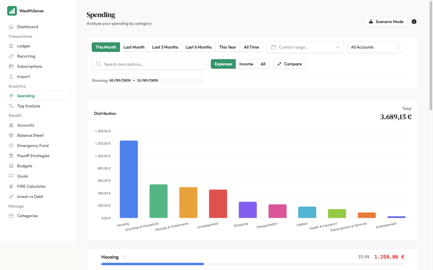
From the sidebar, open Spending. The page heading is "Spending" with the subtitle "Analyze your spending by category". You land on the category bar chart for the default period.
-
Set the period. The dropdown above the chart offers This Month, Last Month, Last 3 Months, Last 6 Months, This Year, All Time, or a custom date range. Start with Last Month — the period is complete and the comparison numbers are honest.
-
Read the bar chart. Bars run largest spend to smallest. The top three are where the money went — read them out loud. If one surprises you, that's where to drill next.
-
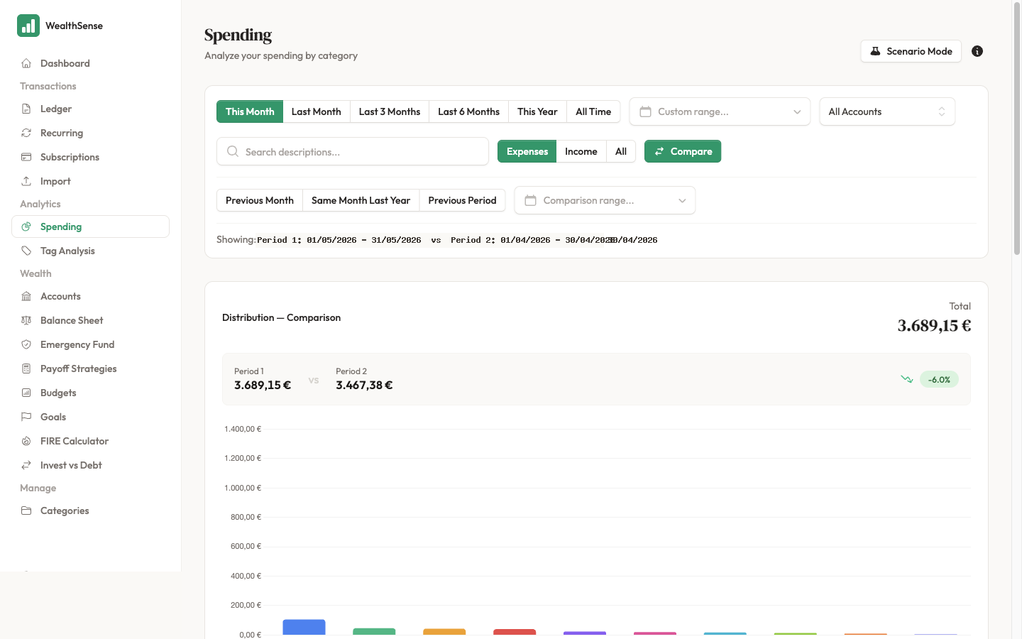
Compare against the previous period. Click Compare above the chart and pick Previous Month (or Same Month Last Year if the categories are seasonal). Each bar now carries a delta — green for less spending than the comparison, red for more. The story is in the deltas: a category that quietly grew month over month tells you more than a single high month.
-
Drill into the category that moved most. Click the bar: parent categories drill into their sub-categories, while leaf categories open the Ledger filtered to the matching transactions. This is the moment "where did the money go?" becomes a specific list of merchants, dates, and amounts you recognise.
-
Switch to the Income vs Expenses widget for the bigger picture. The widget plots your income and expenses month by month over the last 3, 6, or 12 months, plus your average savings rate. The category bars told you what you spent on; this one tells you whether you spent more than you earned.
Tags slice the data a different way — useful for projects like "Italy trip" or "kitchen renovation" that cut across categories. Once you've tagged a few transactions, the tag spending analysis view shows the same bar chart sliced by tag instead of by category.
The spending view is most trustworthy after a reconciliation: until you match the period against the bank, the chart shows whatever you have recorded. Reconcile the month first, then read the chart.
You're done when…
You can name your top three spending categories from last month, point at which one moved most against the month before, and click through to the transactions that explain the move.
See also
- The data has to be true first — Your first reconciliation
- Categorise the data the chart reads — Categorize, split, and tag transactions
- Plan around the patterns the chart shows — Build a budget you'll actually use